M’s Review
I get the premise I just don’t want to
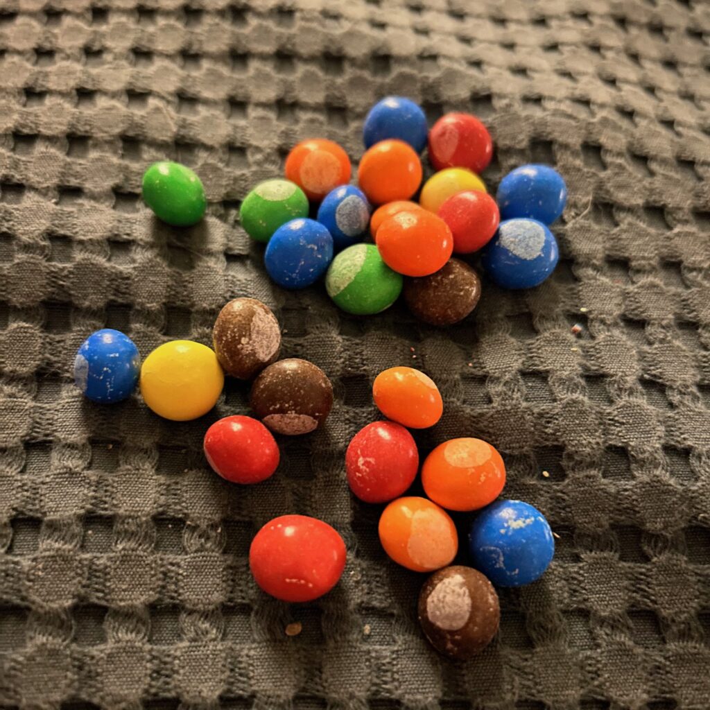
The premise is: imagine the Mars company just said “fuck it” and threw together the most half-assed version of M&M’s just to see if people will still buy the crap they made. Well, we bought it, so points to you this time, Mars. The flavor is still M&M’s, so a pretty bad chocolate taste, but slightly milder than usual. The shape of each candy is inconsistent, which is really the only value in eating M&M’s in the first place: textural consistency. I’m not showing up for the flavor, I’m showing up for the ability to place a disc precisely between my back teeth and gently crack and unpeel it like a hardboiled egg, and this candy fails hard at that. There are no letter “M”s on these things, just broad, milky dots, which make them resemble freshly-cored fish eyes.
So presentation? A+ tbh. I love a horrifying food: it’s art. I just don’t want to eat it.
Theodore’s Review
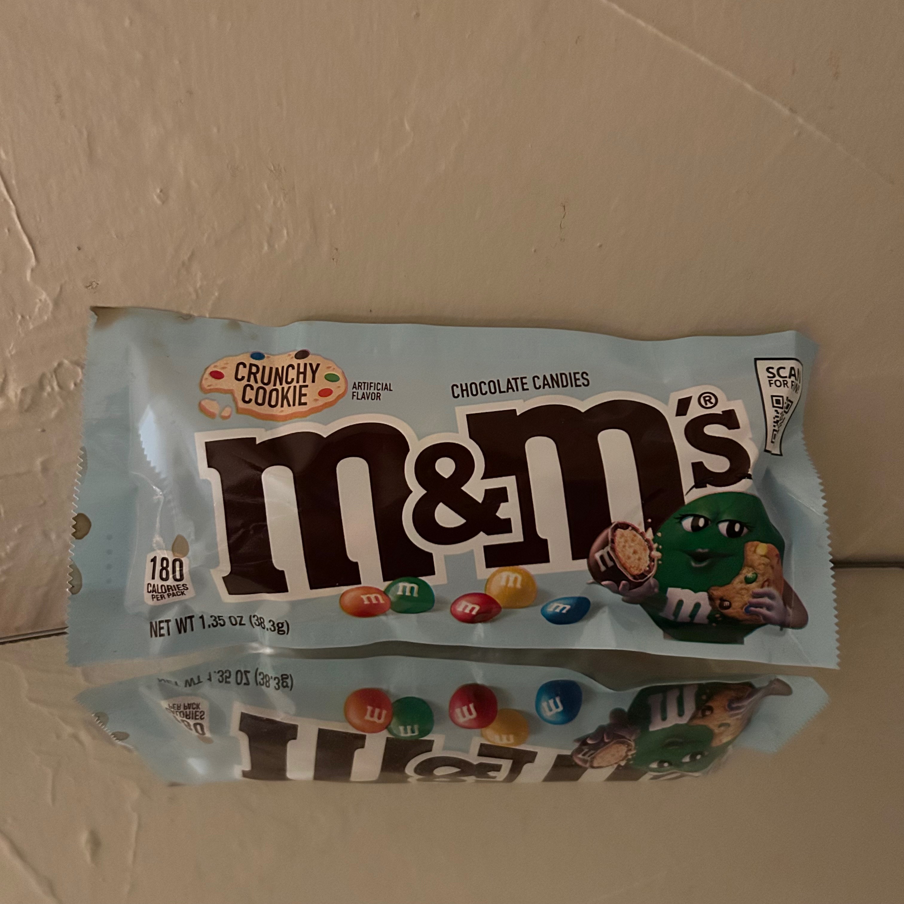
CRUNCHY COOKIE ARTIFICIAL FLAVOR is rice-based, for reference. The texture is wonderful. Firm at first, then closing with a soft pop. The taste is horrid in the way that that all M&M’s are horrid.
But one thing perplexes me. What is this symbol on the surface of the candy? Not the usual M. Not even another letter that I can recognize. A fuzzy circle. What does it mean?
I feel slightly sick. I should not finish the rest, but I will.


Leave a Reply